~ Coauthored by Varsha Chawla and Dale Rierson ~
Here at SAS, we take our sports seriously. With our corporate headquarters in a city surrounded by major universities and with offices all over the world, it’s no wonder that sports data often becomes the forefront of our demos and projects.
As the World Series took place last week, I thought it would be fun to visualize some data from the New York Mets. Luckily, much of the historical World Series baseball data can be found online. With this data source you can analyze schedules, team batting, team pitching, wins, attendance, and comparison to other teams, dating all the way back to 1871. Using SAS Visual Analytics, analyzing lots of data fast is easy.
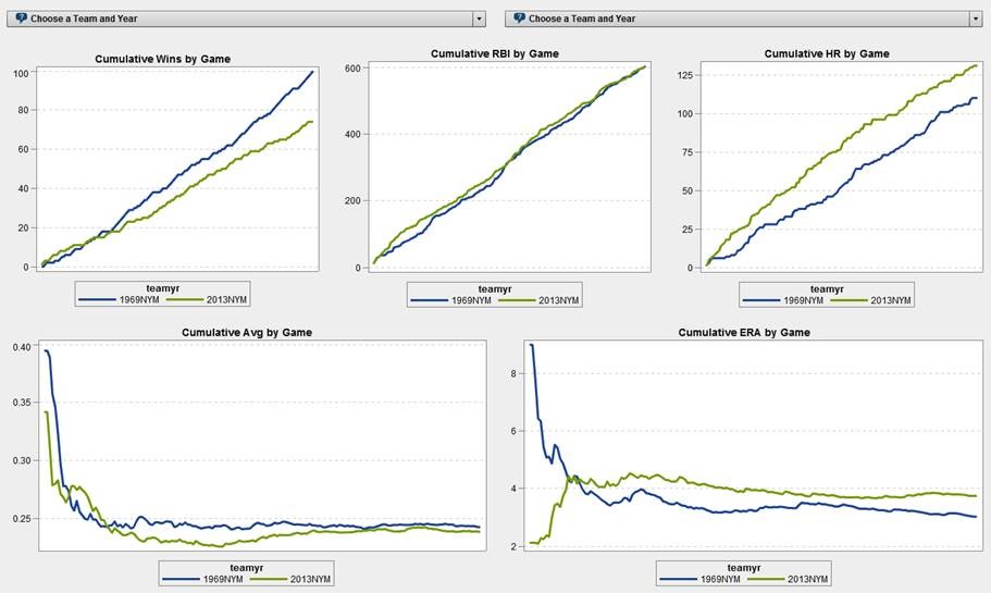
Using SAS Visual Analytics we can see how the 1969 Mets team did against their opponents that year and even look for trends on how well they played on different days of the week.

Correction (HT: Mets Fan Dan)
Thanks go out to Mets fan Dan for pointing out that our screenshot needed correcting. Also, the Opponent in this graph represents the team franchise. For example, WAS represents the Washington Nationals franchise which most baseball fans know did not exist in 1969. In 1969, that team was known as the Montreal Expos.
The screenshot is meant to convey the changes in ERA that each team sees during the course of a season. There are varying windows of time because it took the Mets longer to play 15 games with the St. Louis Cardinals (STL) than it did to play 9 games with the San Diego Padres (SDP). In the highlighted section, the blue line shows the Mets cumulative ERA in Cardinals Stadium at 3.77. While the Cardinals playing at home against the Mets had an ERA of around 6. Translation: The Mets outpitched the Cardinals on the road but were not as dominant at Shea.
The second graph shows you just how dominating the Mets were when they played on Sunday or even on Tuesdays at home, but were pretty ordinary Thursdays on the road.
Baseball statistics history
1969 was celebrated as the 100th anniversary of professional baseball by the Major League Baseball. However in 1969, analysts were just starting to track baseball stats with computers. The amount of data and statistics they tracked then pale to the amount that is being tracked now. For pitchers alone, the MLB now keeps track of measures such as pitch type, pitch speed, perceived speed, spin rate and exit velocity.
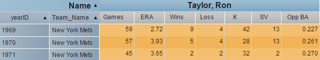
For example, in 1969 “the save” became an official Major League Baseball statistic. A save (SV) is a statistic that rewards relief pitchers who maintain or improve a lead when finishing a game. It was the first major statistic to be added in 49 years since the RBI (Runs Batted In) was added in 1920. Ron Taylor, the relief pitcher for the Mets in game 2 of the 1969 World Series, became the first pitcher to officially receive a save in a World Series.
The other relief pitcher to be officially credited a save in that World Series was a young Nolan Ryan in game 3.
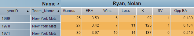
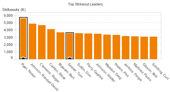
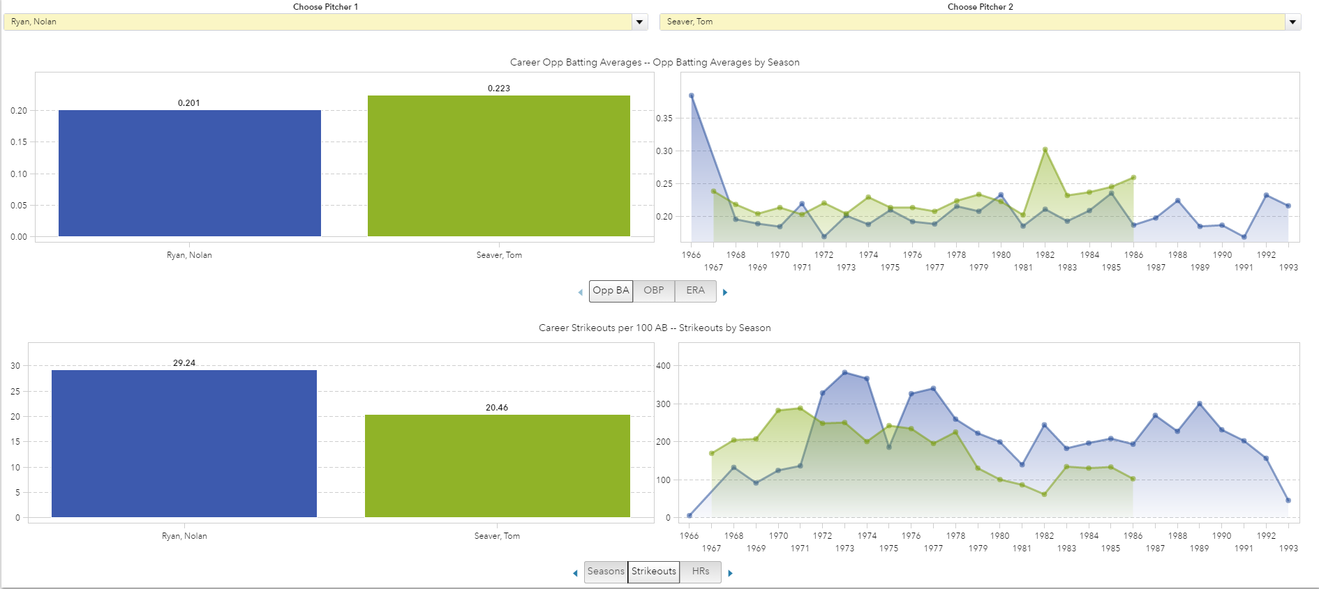
Nolan Ryan then age 22 and team mate Tom Seaver age 24 went on to become two of the all-time best strikeout leaders. Each having a long baseball careers. Nolan Ryan has a record 5,714 strikeouts over a record 27-year career.
Today, new information and statistics in sports are being captured, stored and analyzed at a staggering rate. This is why many sports teams turn to SAS for help. Just like the 1969 Mets, the current Mets pitching team has many young players. Whether or not they will have as remarkable careers as Ryan and Seaver, only time will tell.
Learn how the Mets and other professional sports teams use SAS to engage fans and improve fan loyalty.

4 Comments
The first graph, Pitching by Opponent, has lost me completely. What is supposed to be represented by the X-axis? It’s labeled Date, but there are no specific dates, and given the different widths for different teams, it would seem that each team played a schedule independent of all others, each radically different in length. Beyond that, although the year selected is clearly 1969, two of the teams listed in the Opponent line (COLorado and MIAmi) didn’t exist then, and a third (WAShington) existed as a franchise, but was then in Montreal. And Houston, now in the American League but then in the National, is omitted. And now I see that while on the left Y-axis, the ERAs are arranged in orderly fashion, in 2-run increments, at the right-hand Y-axis, except for 0, the numbers don’t match up. It’s impossible to fathom what this is supposed to convey about NL pitching in 1969.
I’m a Mets fan, and I often see the SAS Analytics electronic billboard displayed during telecasts; I’d be terrified to imagine that this graph is a sample of the quality of information you’re giving my team.
Thanks for the comment, Dan. The authors have updated the post to address some of your concerns.
Ah, yes, much better, thanks. For the record, the number of games played each team were 18 for East Division opponents (CHC, PHI, PIT, STL, and WAS [MON]), 12 for teams in the West (ATL [yes, baseball geography had Atlanta in the West then], CIN, HOU, LAD, SDP, and SFG). As a trivia sidelight, the high leftmost plot points of the home grid vs. WAS reflect the first game the Montreal Expos ever played--an 11-10 victory at Shea Stadium.
I disagree. Read: http://isportsweb.com/2016/06/08/mlb-analytics-year-struggling-aces/